Mobile Application Development
Arsitektur Mobile Platform
ArchitectureWhat is Mobile Computing?
Mobile Computing System = computing systems that can be easily moved physically and whose computing can be used while being moved.
Distinguishing Aspects of Mobile vs Stationary Computing
Prevalent wireless network use — mobility and wireless connectivity are orthogonal (independent) concepts.
Constrained screen real estate, limited input methods, smaller physical form factor.
Battery-powered; performance must balance power consumption.
Used while moving — context-based, task-oriented, situational usage.
Designed to meet the unique needs and behaviors of mobile users in various contexts.
Four Pieces of the Mobile Problem
- Mobile User — moving, context-switching, not focused on computing task
- Mobile Device — hardware with limited capabilities
- Mobile Application — software optimized for mobile settings
- Mobile Network — wireless, variable, potentially unreliable
Wireless Communication Generations
Mobile Application Types
| Type | Description | Examples | Pros / Cons |
|---|---|---|---|
| Text-based App | Content provider, SMS alerts, USSD codes | SMS alerts | Simple, low-tech |
| Mobile Website | Focus on content, simple interaction | News sites on browser | No install needed |
| Mobile Web App | Web-based with application-like experience. HTML, CSS, JS. | Gmail, Facebook web | + Single code base, no App Store dependency − Limited device feature access |
| Native App | Platform-specific: iOS (Swift/ObjC), Android (Kotlin/Java) | Instagram native iOS | + Faster, full device API access − Multiple code bases |
| Games | Usually native, graphics-heavy, often bypass Java API framework | PUBG Mobile | High performance needed |
Application Context Types
Short task-based. Minimal UI. e.g., Timer, Calculator, Weather.
Location-based. Maps, navigation, location-aware discounts.
Provides information. News, directory, marketing site.
Task-based, priority-ordered. Address book, shopping.
Focuses user on app. Games. Full-screen experience.
Mobile Platform Architecture Layers
A mobile platform consists of multiple layers from hardware up to developer tools:
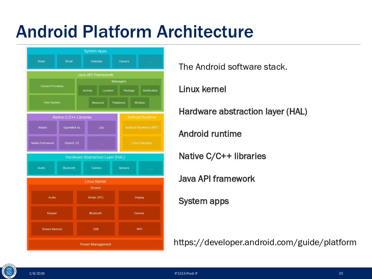
Android Platform Architecture
Architectural Styles for Mobile Apps
- Thin-client wireless client-server — logic on server, thin UI on device
- Thick-client wireless client-server — significant logic on device too
- Stand-alone applications — works fully offline, no server needed
A VM (like ART on Android) abstracts hardware specificity, enabling code portability. However, performance considerations are more critical on mobile than desktop due to resource constraints.
Model Proses
Process ModelWhat is SDLC?
Software Development Life Cycle (SDLC) = a structured series of steps to design, develop, test, and maintain software. Goal: ensure software meets user needs and works correctly.
Benefits of SDLC
- Ensures quality and consistency
- Efficiency in time and cost
- Easier maintenance and updates
- Better team collaboration
- Adaptability to changes
Core Software Development Activities
| Activity | Description |
|---|---|
| Komunikasi | Project initiation, requirement gathering |
| Perencanaan | Estimation, scheduling, tracking |
| Pemodelan | Analysis and Design |
| Konstruksi | Programming and Testing |
| Deployment | Delivery, support, feedback |
Process Flow Types
Sequential — each phase completes before the next starts.
Phases repeat in cycles, refining the product each time.
Multiple activities run simultaneously in different streams.
Product evolves through releases (v1 → v2 → vN).
Waterfall Model
The classic linear process model. Each phase must fully complete before moving to the next. You cannot skip two phases back.
Requirements almost always change — Waterfall can't handle this well. Users wait until the end to see the product. Blocking states occur where team members idle waiting for others. Not suited for complex systems with many stakeholders.
Agile Methodology
Agile collects requirements iteratively and evolutionarily. A functionality is completed fully (requirements → code → unit tests) before starting the next.
The Agile Manifesto (4 Values)
- Individuals and interactions
- Working software
- Customer collaboration
- Responding to change
- …over processes and tools
- …over comprehensive documentation
- …over contract negotiation
- …over following a plan
Agile Variants
- Scrum (sprint-based, 2-week cycles)
- Kanban (flow-based, continuous)
- Extreme Programming (XP)
- Feature Driven Development (FDD)
- Dynamic Systems Development Method (DSDM)
- Agile Unified Process (AUP)
SDLC for Mobile Apps — 6 Phases
Adapted Agile for Mobile — 5 Practices
Scrum: 2-week sprints. Kanban: continuous flow-based delivery.
User Stories & Epics. Prioritize by business value. Define MVP early.
Automate builds (GitHub Actions, Jenkins, Bitrise). Feature toggling for phased rollouts.
Analytics (Mixpanel, Firebase). A/B testing. Adapt backlog based on user needs.
PM, devs, designers, QA collaborate. Daily stand-ups, sprint reviews, retrospectives.
Key Terms
Cross Platform
TechnologyThe Key Challenge: Fragmentation
Each mobile platform has different interfaces, standards, programming languages, APIs, capabilities, and SDKs. Even within the same platform, devices differ in memory, screen resolution, etc.
3 Mobile Development Approaches
Use platform-specific languages and tools.
Android: Kotlin/Java + Android Studio
iOS: Swift/ObjC + Xcode
Web technologies running in mobile browser. JS, HTML, CSS. Tools: React, Vue, Angular.
Single code base targeting multiple platforms. Top tools: React Native, Flutter.
Why Use Cross-Platform?
- Reusable code across platforms
- Rapid time to market
- Robust performance
- Close-to-native UX
- Broad audience reach (Android + iOS simultaneously)
- Greater cost efficiencies
React Native (by Meta/Facebook)
Open-source framework using JavaScript + React to build native apps for Android, iOS, and more. First developed in 2013 internally at Facebook, public release in 2015.
React Native Architecture Components
React Native Render Pipeline
// The 3-step pipeline:
Render  →  Commit  →  Mount

// View Flattening: optimization to avoid deep layout trees
// Views (2) and (3) merged into (1) via diffing algorithm
Core Components (Native Components wrapped for JS)
- View — basic rectangular container
- Text — displays text
- Image — displays images
- TextInput — text input field
- ScrollView — scrollable container
- FlatList — optimized list rendering
Flutter (by Google)
Open-source framework for building natively compiled, multi-platform apps from a single codebase. Uses Dart language. Released as open source in 2017.
Flutter Architecture (Layered)
flutter create.Flutter Rendering Process (Widget → Pixels)
React Native vs Flutter Comparison
| Aspect | React Native | Flutter |
|---|---|---|
| Language | JavaScript | Dart |
| By | Meta (Facebook) | |
| UI Approach | Uses native components via bridge/JSI | Custom renderer (Impeller/Skia) — draws own widgets |
| Community | Very large (JS ecosystem) | Rapidly growing |
| CI/CD | EAS (Expo) or third parties | Rich default CLI |
| Best For | Teams with strong JS/Web background | Teams with budget for Dart learning; pixel-perfect UI |
Framework Choice Guidelines
Your team has strong JavaScript or web background. Easier to reuse existing skills, reduces cost and development time.
You have enough budget and resources. Dart is not widely used, so learning curve is higher — but the result is consistent pixel-perfect UI across platforms.
Intro to Android
Android SDKWhat is Android?
- Mobile OS based on Linux kernel
- UI designed for touch screens
- Used on over 80% of all smartphones
- Powers watches, TVs, cars, and more
- Open-source. 3+ billion monthly active devices.
- 2.5+ billion monthly active Google Play users. 2M+ apps.
Android Software Developer Kit (SDK)
- Development tools: debugger, monitors, editors
- Libraries: maps, wearables, ML
- Virtual devices (emulators/AVDs)
- Documentation at developer.android.com
- Sample code
Kotlin — The Language for Android
Less boilerplate than Java. Modern language features.
Null safety built-in. Eliminates NullPointerExceptions by default.
100% compatible with Java. Can call Java libraries from Kotlin.
Coroutines for async code without callback hell.
API Levels — Three Key SDK Versions
4 Types of Application Components
A single screen with a user interface. Entry point for user interaction.
Hotel analogy: the registration desk
Performs long-running tasks in the background (no UI).
Hotel analogy: laundry service
Responds to system-wide announcements (battery low, SMS received).
Hotel analogy: package arrival notification
Manages a shared set of app data (contacts, media).
Hotel analogy: city tour companies
App Building Blocks
build.gradle (Module): dependencies, SDK versions. build.gradle (Project): repositories, global config.Views — Building Blocks of UI
"Everything you see is a View." Views are Android's basic UI building blocks — rectangular elements on screen.
Common View Classes
- TextView — displays text
- ImageView — displays images
- ScrollView — scrollable container
- RecyclerView — efficient lists
- Button — clickable button
- EditText — editable text field
- CheckBox — on/off toggle
- RadioButton — single selection
- SeekBar — range slider
- Switch — toggle switch
View Size Options
48dp. Use dp not px.ViewGroups — Layout Containers
android:orientation to horizontal or vertical.Event Handling
// SAM (Single Abstract Method) — concise click listener
button.setOnClickListener { view ->
    /* handle click */
}

// Modify a View dynamically
val resultTextView: TextView = findViewById(R.id.textView)
resultTextView.text = "Goodbye!"

// Event flow: User interacts → Event fired → Check callback → Execute or ignore
Gradle — Build System
- Build automation system
- Manages the build cycle via a series of tasks (compile Kotlin, run tests, install APK)
- Determines proper task order and manages dependencies
Accessibility Best Practices
- Touch target size: at least 48dp × 48dp
- Set
contentDescriptionon images and controls for screen readers - Use TalkBack — Google's screen reader for Android
- Use Switch Access for users who cannot use touch
Layouts
Android UISize Units in Android
DP Formula
Screen Density Buckets
| Qualifier | Description | DPI Estimate | Scale Factor |
|---|---|---|---|
| ldpi | Low density (mostly unused) | ~120 dpi | 0.75× |
| mdpi | Medium density (baseline) | ~160 dpi | 1× |
| hdpi | High density | ~240 dpi | 1.5× |
| xhdpi | Extra-high density | ~320 dpi | 2× |
| xxhdpi | Extra-extra-high density | ~480 dpi | 3× |
| xxxhdpi | Extra-extra-extra-high density | ~640 dpi | 4× |
View Rendering Cycle
Determine the size of each view based on constraints and content.
Position each view within its parent container.
Render the views onto the screen.
View Spacing
Space outside the view's border — pushes the view away from other elements.
android:layout_margin="16dp"
android:layout_marginTop="8dp"Space inside the view's border — pushes content away from the edge.
android:padding="16dp"
android:paddingStart="8dp"
ConstraintLayout
Recommended default layout for Android. Solves the costly issue of too many nested layouts while allowing complex behavior. Positions and sizes views using constraints.
Deeply nested ViewGroups require more computation. Views may be measured multiple times. This causes UI slowdown and lack of responsiveness. ConstraintLayout solves this with a flat hierarchy.
Constraint Format
Example Constraints
<TextView
    app:layout_constraintTop_toTopOf="parent"
    app:layout_constraintBottom_toBottomOf="parent"
    app:layout_constraintStart_toStartOf="parent"
    app:layout_constraintEnd_toEndOf="parent" />  ← centers the view
Constraint Widget Sizes
match_parent in ConstraintLayout children.Chains in ConstraintLayout
Chains let you position views in relation to each other (horizontally or vertically). Provide much of LinearLayout functionality.
| Chain Style | Description |
|---|---|
| Spread Chain | Views spread evenly across available space (default). |
| Spread Inside | First and last views at edges; space distributed between remaining views. |
| Weighted Chain | Views take up space proportional to their weights. |
| Packed Chain | Views packed together at center of available space. |
Guidelines
Invisible layout helpers that let you position multiple views relative to a single guide. Can be vertical or horizontal. Not drawn on device.
<Guideline
    android:orientation="vertical"
    app:layout_constraintGuide_begin="16dp" />

<!-- Specify one of these: -->
layout_constraintGuide_begin   ← from start
layout_constraintGuide_end     ← from end
layout_constraintGuide_percent ← percentage of parent (0.0–1.0)
Groups
Control the visibility of a set of widgets as a group.
// Toggle group visibility
if (group.visibility == View.GONE) {
    group.visibility = View.VISIBLE
} else {
    group.visibility = View.GONE
}
// Visibility constants:
// VISIBLE   → shown
// INVISIBLE → not shown but TAKES space
// GONE      → not shown and does NOT take space
Data Binding
Bind UI components in layouts directly to data sources — replaces repetitive findViewById() calls.
Setup
// 1. Enable in build.gradle
android {
    buildFeatures { dataBinding = true }
}

// 2. Wrap layout in <layout> tag
<layout>
    <data>
        <variable name="name" type="String"/>
    </data>
    <ConstraintLayout>
        <TextView android:text="@{name}" />
    </ConstraintLayout>
</layout>

// 3. Use binding in Activity
val binding: ActivityMainBinding = DataBindingUtil.setContentView(this, R.layout.activity_main)
binding.name = "John"ViewBinding: Ties View to a Binding Class, providing static access to views — but does NOT tie variables/data to views. Data Binding: Does both. For reactive two-way binding, use Data Binding with LiveData or Observable objects. With Jetpack Compose, binding is not needed as it provides its own reactive framework.
RecyclerView
Widget for displaying lists of data. "Recycles" (reuses) item views when they scroll off-screen to make scrolling more performant.
RecyclerView Key Parts
getItemCount, onCreateViewHolder, onBindViewHolder.class MyAdapter(val data: List<Int>) : RecyclerView.Adapter<MyAdapter.MyViewHolder>() {
class MyViewHolder(val row: View) : RecyclerView.ViewHolder(row) {
val textView = row.findViewById<TextView>(R.id.number)
}
override fun onCreateViewHolder(parent: ViewGroup, viewType: Int): MyViewHolder {
val layout = LayoutInflater.from(parent.context).inflate(R.layout.item_view, parent, false)
return MyViewHolder(layout)
}
override fun onBindViewHolder(holder: MyViewHolder, position: Int) {
holder.textView.text = data.get(position).toString()
}
override fun getItemCount(): Int = data.size
}MD vs HIG
UI/UX DesignOverview
Google's design standard for Android. Based on the "material metaphor" concept — digital surfaces with real-world physics, shadows, and movement.
Apple's design standard for iOS. Focuses on simplicity, clarity, and deference to user content. Transparency and layering for depth.
Core Design Principles
| Aspect | Material Design | Human Interface Guidelines |
|---|---|---|
| Philosophy | Material metaphor — digital surfaces with real-world properties (shadows, depth) | Simplicity, clarity, and deference to user content |
| Core Principle 1 | Material as Metaphor: realistic shadows and movement | Clarity: legible and visually distinct interface |
| Core Principle 2 | Bold Graphics & Intentional Colors: vibrant palettes, strong contrast | Deference: UI elements support content, don't overshadow it |
| Core Principle 3 | Meaningful Motion: animation provides visual cues for understanding | Depth through Transparency: blur and layering for hierarchy |
| Core Principle 4 | Adaptive Design: optimized for different screen sizes and orientations | Intuitive Navigation: familiar interactions, smooth transitions |
Navigation Patterns
- Navigation Drawer — side menu for quick access to app sections
- Top Tabs — tabs at top of screen
- Back Button — physical or on-screen button for backward navigation
- Bottom Navigation Bar — quick access to primary sections
- Hierarchical Navigation — back button in top-left corner
- Swipe Gestures — swipe left/right for navigation
Visual Elements: Icons, Colors, Animations
| Element | Material Design | HIG (iOS) |
|---|---|---|
| Icons | Colorful, bright, detailed, expressive | Flat & monochromatic, minimalistic, simple |
| Depth | Shadows & elevation create hierarchy | Transparency & blur (no heavy shadows) |
| Animation | Explicit, smooth, meaningful movement | Natural, seamless, fluid transitions |
Layout Approach
- Grid-Based Layout: responsive grid system with columns, gutters, margins
- Responsive Design: adapts to various screen sizes and orientations
- Alignment and Spacing: precise alignment enhances readability
- Consistency: elements with similar functions have uniform appearance
UI Components Comparison
| Component Type | Material Design | HIG (iOS) |
|---|---|---|
| Buttons | Text, Elevated, Filled, Outlined (varying emphasis) | System, Detail Disclosure, Info buttons |
| List/Card | Cards — encapsulate related info (image, text, actions) | Collection Views — similar function, different pattern |
| Text Input | Text Fields — labels, helper text, floating hints | Text Fields — built-in auto-correction, search capabilities |
| Navigation | Navigation Drawer — hidden side menu | Tab Bar — persistent bottom navigation |
Apple Liquid Glass (2025 — new in HIG)
Semi-transparent surfaces that reveal layers beneath.
Smooth, liquid-like animations and transitions.
Material that appears to refract and bend light realistically.
Impact on UX
More flexibility and customization. Android offers diverse UX possibilities but at the cost of potential inconsistency across apps.
More consistent and structured experience. Uniform patterns across all iOS apps create predictable UX.
Follow official guidelines for each platform. Cross-platform apps must consider both UI/UX paradigms. Don't just port an Android design to iOS or vice versa — adapt to each platform's conventions.
Non-Nullability (Kotlin Null Safety)
KotlinThe Problem: The Billion-Dollar Mistake
Tony Hoare invented the null reference in 1965 for ALGOL W. He later called it his "billion-dollar mistake" — it has led to innumerable errors, vulnerabilities, and system crashes. In Java: NullPointerException (NPE).
Kotlin's Solution: Non-Nullable by Default
In Kotlin, all reference variables are non-nullable by default. If you want a nullable reference, you must explicitly declare it with the ? suffix (nullability marker).
// Non-nullable (default) — cannot be null
var name: String = "Alice"
    name = null  // COMPILE ERROR

// Nullable — must use ? suffix
var name: String? = "Alice"
    name = null  // OK
Null Safety Operators
A.B if A is not null. Returns null if A is null — never throws NPE. Great for chaining: if any part is null, entire chain returns null.val len = name?.length // Int? (nullable)
// Chaining:
user?.address?.city?.nameval name = nullableName ?: ""
// Equivalent to:
val l: Int = if (b != null) b.length else 0
// Elvis version:
val l: Int = b?.length ?: 0val b = a!! // Throws NPE if a is null
// Use sparingly — defeats null safety purposeUninitializedPropertyAccessException if accessed before init.lateinit var result: TextView
override fun onCreate(...) {
result = findViewById(R.id.result)
}Summary: Null Handling Decision Tree
Language Null Safety Comparison
| Language | Null Concept | Default Non-null? | Compile-time? | "Trust Me" Escape |
|---|---|---|---|---|
| Kotlin | null / T? | Yes | Yes | !! — throws NPE if null |
| Rust | None / Option<T> | Yes | Yes | .unwrap() — panics if None |
| Dart | null / T? | Yes (since 2.12) | Yes | ! suffix — throws if null |
| TypeScript | null / T | null | Opt-in | Yes (with strictNullChecks) | Type assertions as T |
| Java | @Nullable / @NonNull | No | Tools only | Any reference is nullable by default |
| Python | None / Optional[T] | No | Tools only | Type hints ignored at runtime |
| JavaScript | null + undefined | No | No | Everything nullable, no enforcement |
| C++ | nullptr | No | No | Raw nullptr dereference = undefined behavior (silent crash) |
By making non-null the default, the compiler warns you at the point of assignment (not at runtime crash). If you need null, you explicitly opt-in with ?, which forces you to handle the null case. This moves NPE bugs from runtime crashes to compile-time errors.